Metropolitan Picture Framing is a corporate sponsor of Covered in Time and History: The Films of Ana Mendieta that is currently at the Katherine E. Nash Gallery at the University of Minnesota.
Our company became involved after meeting with Howard Oransky, the Director of the Katherine E. Nash Gallery. In the meeting it became clear we both have a special interest in feminist art and Howard wanted to tell me about an exhibition he had been working on since the first day he became the director of the Katherine E. Nash Gallery in 2011.
This exhibition opened September 15, 2015. I was so impressed with the work that went into mounting this exhibit, I asked Howard if he would be willing to give an interview about the process. When Howard and I first met, he said he wanted the Katherine E. Nash Gallery to take a leadership role in the larger art community not only in Minnesota but nationally and internationally. I think this behind the scenes view of the “Covered in Time and History: The Films of Ana Mendieta” exhibit is a perfect example of his vision for the gallery.
Karen Desnick, Metropolitan Picture Framing
How did you decide to do an exhibition on Ana Mendieta?
Howard Oransky, Katherine E. Nash Gallery
One day in 1978 I went to meet my girlfriend, Anna R. Igra, who was the editor of Together, the feminist newspaper published by students at UCLA. Sitting in her office I picked-up a copy of Heresies, a magazine I did not recognize and there I saw an image by Ana Mendieta, an artist I had never heard of. It was a black-and-white photograph of the Silueta del Laberinto (Laberinth Blood Imprint) made at the archeological site in Yágul, Mexico in 1974. It was so different from other earth-based artworks from that time. Rather than using the earth as an object, she was collaborating with that place and the history it represented to make an ephemeral statement on location, memory and identity. It completely blew my mind.
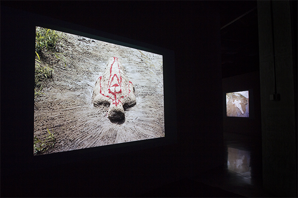
In 1984 we moved to New York and in 1987 we saw the career survey of Mendieta’s work at the New Museum of Contemporary Art. That was the first time I saw her films, on a small video monitor, and again her work completely disrupted and rearranged my ideas about art, what it could mean, how it could operate. I saw the film Anima, Silueta de Cohetes from 1976 on that little monitor and I was absolutely stunned by the beauty of that film. Her shape, the Silueta, was outlined in fireworks, illuminating the night sky in Oaxaca, Mexico. It was a poetic metaphor on human experience, the brief moment of time we occupy, the relic of memory.

Ana Mendieta
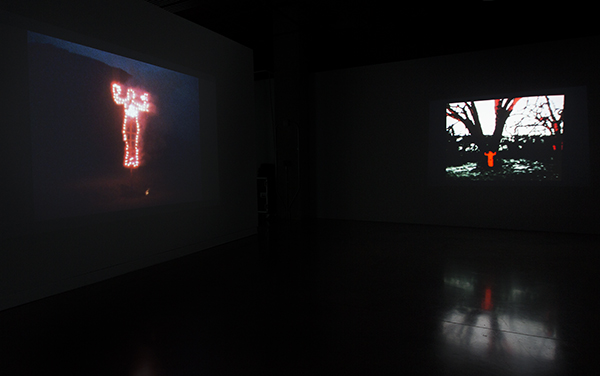
Left: Anima, Silueta de Cohetes (Firework Piece), Summer 1976, Oaxaca, Mexico, Super 8 film, color, silent, 2 min. 23 sec., Filmwork No. 53. Right: Energy Charge, 1975, 16mm film, color, silent, 49 sec., Filmwork No. 43. © The Estate of Ana Mendieta Collection, LLC. Courtesy Galerie Lelong, New York. Installation photograph by Amber White.
In 1994 we moved to Minnesota. In 2005 we visited the Des Moines Art Center to see the exhibition Ana Mendieta: Earth Body, Sculpture and Performance 1972 – 1985, a large traveling career survey organized by Olga Viso for the Hirshhorn Museum and Sculpture Garden in Washington, D.C. Olga’s exhibition included 10 of Mendieta’s films, projected in the gallery from digital translations that had recently been made by the Estate of Ana Mendieta Collection. That exhibition was another revelation for me, because I could see and appreciate the importance of the films within the larger context of Mendieta’s overall artistic career.
In 2007 Olga became the Executive Director of Walker Art Center, where I was on staff at the time. In my first meeting with her on October 7, 2007 I asked Olga to sign my copy of her Earth Body catalogue and I told her how much I admired Ana Mendieta’s work and her exhibition. In that meeting she told me that Mendieta had made many more films that people realized and that the Estate was interested in preserving them and making them more available to a wider audience through the newer digital technologies. She suggested to me that eventually it would be possible to organize an exhibition that would be focused on the films and their importance within Mendieta’s career. On that day I decided that I wanted to organize such an exhibition.
Karen Desnick, Metropolitan Picture Framing
I know you worked with Raquelín Mendieta the artist’s sister and Administrator of the Estate of Ana Mendieta, Raquel Cecilia Mendieta the artist’s niece and Archivist of the films for the Estate of Ana Mendieta, and Mary Sabbatino the Vice President and Partner of Galerie Lelong, New York, which represents the Estate of Ana Mendieta Collection. Can you talk about how you first contacted them with the idea and the steps involved in working with each of them.
Howard Oransky, Katherine E. Nash Gallery
In 2011 I applied to be Director of the Katherine E. Nash Gallery at the University of Minnesota. In my interview Prof. Lynn Lukkas, chair of the search committee, asked me what “big project” did I hope to do there? I told her it would be an exhibition of Ana Mendieta’s films. Lynn would later join the project as a co-curator. The day I signed my contract, as I left the building, I saw an announcement that Olga Viso would be giving a lecture there that evening. After dinner, I returned to the University of Minnesota to see her lecture and we discussed the film exhibition idea. Olga introduced me to Mary Sabbatino at Galerie Lelong and I proposed the film exhibition to Mary.
A series of visits to New York followed; to meet Mary and subsequently to meet Raquelín, to repeatedly view the entire collection of films and discuss how with them how such an exhibition could be organized, to review which films had been digitized and plans for further restoration, to consider how the films might be supplemented with thematically-related photographs, and so on. At that time we all imagined the project would be “a little exhibition of films.” In one of our meetings I had the idea that we would also research and publish the first complete, illustrated Filmography of all of Ana Mendieta’s films. That was a turning point in the project and greatly expanded the scope of our efforts at the University of Minnesota, at the Estate of Ana Mendieta Collection, and at Galerie Lelong.
The Estate of Ana Mendieta Collection and Galerie Lelong were committed to major career surveys of Mendieta’s work that were planned for the Hayward Gallery in London (Traces, which opened in 2013 and subsequently toured to Salzburg and Prague) and at the Castello di Rivoli in Turin (Ana Mendieta: She Got Love, which opened in 2013). As those projects neared completion, with our research on the Filmography underway, and with the availability of very precise, high-definition 2K digital technologies, the Estate and the Galerie embarked on a massive effort to fully catalogue, document, restore, and carefully translate the films to high-definition format. During that process and in preparing all the films for the exhibition, the still images for the catalogue, and the written documentation, we also worked with Raquel Cecilia Mendieta, as well as Sarah Landry, the Archivist at Galerie Lelong.
These individuals invested an enormous amount of time, effort and resources to help make this project possible. Their expertise and commitment to Mendieta’s work is the foundation on which our exhibition and catalogue stands. I prefer working in collaboration and it has been a rare privilege for me to work closely with such an extraordinarily dedicated and talented team.
Karen Desnick, Metropolitan Picture Framing
I know that Laura Wertheim Joseph, a PhD student, also worked on this project. It is not often that a student has her original research published by a major University press just as she finishes her education at a university. This is a very concrete example of your belief that a university should be a “laboratory for the study and interpretation of the visual arts.” Can you tell us more about how this happened and Laura’s involvement with the process?
Howard Oransky, Katherine E. Nash Gallery
The first exhibition I organized at the Katherine E. Nash Gallery was Lynn Hershman Leeson: Investigations, in 2011. Lynn Lukkas also acted as a co-curator of that exhibition and we worked in collaboration with Siri Engberg, Sheryl Mousley, and Dean Otto, curators at Walker Art Center. While working on that project I asked Jane Blocker, Professor of Art History, for a recommendation of an Art History student who would like to work on the exhibition. At Jane’s suggestion I invited Laura Wertheim Joseph to participate by researching and writing the gallery brochure and object labels, and she also gave a lecture on Lynn Hershman Leeson at the Nash Gallery. Laura did an excellent job on that project.
At the beginning of the Mendieta project we knew we’d need help with researching the exhibition catalogue. Jane Blocker wrote a grant at the University of Minnesota and with that funding we were able to hire Laura in 2012 for one year. When I suggested we publish a filmography, Laura took on the role of researching and writing the filmography. It was a much larger endeavor than we originally imagined, and Laura stayed with it until the catalogue was finally published in September 2015. In the end, the story behind the filmography became equally important and we published a separate essay, fully researched and written by Laura, as well as the filmography.
I wanted to be director of the Katherine E. Nash Gallery because I think a university is the perfect environment in which to further our study and understanding of the visual arts. I believe the visual arts are connected to all aspects of human experience and here at the University of Minnesota all the disciplines intellectual and artistic inquiry are represented. Involving young artists and scholars in the exhibitions program at the Katherine E. Nash Gallery is one of the ways we are able to make it a “laboratory for the study and interpretation of the visual arts” as stated in our long range plan. I am very pleased and proud that the Katherine E. Nash Gallery is an important and valued educational resource for our students, faculty, staff and the wider community.
Karen Desnick, Metropolitan Picture Framing
The book Covered in Time and History: the films of Ana Mendieta was published by the Katherine E. Nash Gallery, University of Minnesota in association with the University of California Press. Publishing a book is a major undertaking. Did you always intend to publish a book with original research on the exhibit? I know you had many collaborators inside and outside of the university. Can you talk about the process necessary to get the book published?
Howard Oransky, Katherine E. Nash Gallery
At the beginning of the project Mary Sabbatino and I agreed that the exhibition should have a catalogue. Similarly to our original idea for a “little exhibition of films,” our original idea for the catalogue was rather modest. I think the decision to publish the first complete filmography of all of Ana Mendieta’s films was a turning point in the development of the catalogue. My recollection is being in a meeting at Galerie Lelong and I heard someone say “we should publish a complete filmography of all of Mendieta’s films” and then realized I was the one who said it. It just seemed like a good idea at the time. This became the core of the original research and it branched out from there.
Jane Blocker, Lynn Lukkas and I worked together on the initial development of the catalogue. In its finished state the book is now comprised of three main parts. The first part places Mendieta in historical context and discusses the films from these different vantage points. The second part is a detailed interpretation of each of the 21 films in the exhibition. The third part contains the documentation and research. In addition to the essay and filmography by Laura Wertheim Joseph there is a detailed essay by Raquel Cecilia Mendieta that explains for the first time the history and technical specifications of the translations from film and video to digital formats.
Publishing the book was necessarily an involved process. We have a variety of contributions written by 7 authors, plus a complete visual documentation of all the films produced for the book from the high definition transfers by the Estate. Matthew Rezac beautifully designed the book; I absolutely adore the design of the book. For example, the stamped text on the case follows the design of the Silueta on the cover; the end papers (beautifully conceived and assembled by Raquel Cecilia) contain ephemera from Mendieta’s filmworks; the color scheme established on the title and half-title pages echoes the film Anima, Silueta de Cohetes (the first Mendieta film I saw, in 1987); the table of contents is followed by a second 2-page spread of film-related ephemera; then the actual text begins. It’s a sensitive and artful opening to the book. Matthew’s design for the texts is different in each section. The first part is discursive, the second part is theatrical, and the third part is documentary; but the overall design feeling is carried through from beginning to end.
Marquand Books in Seattle showed our catalogue to many publishers and distributors. In the end, we were delighted to work with University of California Press as our co-publisher.Their outside reviewer recognized the importance of the research contributions in the book and their marketing staff are doing a fabulous job of promoting the book. All exhibitions have a relatively short lifespan, but the book will tell the story of Mendieta’s films well into the future and inspire others to add their research and interpretation to the ongoing dialogue on her work.
Karen Desnick, Metropolitan Picture Framing
I know that Raquel Cecilia Mendieta is the archivist of the films for the Estate. Because of this exhibition she spent hours looking at the original Super 8 films as they were converted to digital format. And some of the films that were already converted to digital needed to be upgraded to a newer digital technology. In the process she discovered some films that she didn’t know existed. She also was able to see details in the images that couldn’t be seen on the analog film. This is clearly a case of art history being preserved that would have been lost without this work. Can you talk about this?
Howard Oransky, Katherine E. Nash Gallery
One of the great pleasures of the exhibition for me is that we are able to show some films that had very little or no previous exposure or have been restored so that we see them more the way Ana Mendieta saw them. A good example of that is the film Sweating Blood, which Raquel Cecilia discussed in her essay and in the public presentation at the Regis Center for Art on September 19. Seeing the short clips of the film in its different iterations and then in the very precise high definition digital format is amazing. I had seen this film many times over the years, but it wasn’t until we installed it in the gallery that I really saw it. In the new transfer I could see Ana Mendieta’s neck and the detail of her hair in the dark background. Given that this film is entirely focused on her face and head, these seemingly minor details are actually very significant. It was a revelation for me.

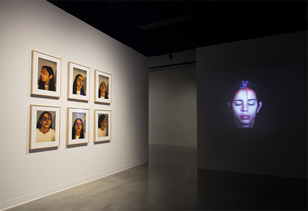
Ana Mendieta Left: Self-Portrait with Blood, 1973/1997, Suite of six color photographs, framed, 20 x 16 in. (50.8 x 40.6 cm) each. Right: Sweating Blood, November 1973, Super 8 film, color, silent, 3 min. 18 sec., Filmwork No. 14. © The Estate of Ana Mendieta Collection, LLC. Courtesy Galerie Lelong, New York. Installation photograph by Amber White.
Films in the exhibition with very little previous exposure include the first one you see as you enter the gallery (which is also on the cover of the book) Untitled: Silueta Series, 1978; the astonishing Blood Inside Outside from 1975; and Silueta del Laberinto (Laberinth Blood Imprint) from 1974. I am especially pleased to have this film in the exhibition. We are showing it together for the first time with Burial Pyramid. Both of these films were made in the summer of 1974 at the archeological site in Yágul, Mexico and show Mendieta’s deep and abiding interest in history. Silueta del Laberinto (Laberinth Blood Imprint) also has special meaning for me personally because that is the artwork I saw represented in Heresies in 1978 and first introduced me to the art of Ana Mendieta.

Ana Mendieta
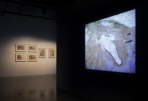
Left: Blood Sign, March 1974, Iowa, Super 8 film, color, silent, 5 min. 36 sec., Filmwork No. 17. Right: Blood Inside Outside, June 1975, Old Man’s Creek, Sharon Center, Iowa, Super 8 film, color, silent, 4 min. 19 sec., Filmwork No. 35. © The Estate of Ana Mendieta Collection, LLC. Courtesy Galerie Lelong, New York. Installation photograph by Amber White.
One of the films in the exhibition, Untitled, 1981 has never been seen publicly. Raquel Cecilia discovered this film as she was once again checking through all the original materials and records as we neared completion of the catalogue. This is a gorgeous, black-and-white film made at the beach in Guanabo, Cuba and tells the story of separation from Cuba and longing for return and reconciliation. Raquel found a box used by Ana Mendieta to hold Agfa photographic paper and opened it. An envelope inside contained the original Super 8 film. That box appears on page 6 in the catalogue.
Karen Desnick, Metropolitan Picture Framing
The installation of the exhibition is beautiful. I know special projectors were needed and the gallery was closed to make structural as well as cosmetic changes. Can you talk about what was involved?

Ana Mendieta
Left: Ana Mendieta, Nature Inside, 2015, Produced and edited by Raquel Cecilia, Blu Ray/color, sound, 8 min. © Corazón Pictures, LLC. Right: Ana Mendieta, Silueta de Arena, August 1978, Iowa, Super 8 film, color, silent, 1 min. 33 sec., Filmwork No. 65. © The Estate of Ana Mendieta Collection, LLC. Courtesy Galerie Lelong, New York. Installation photograph by Amber White.
Howard Oransky, Katherine E. Nash Gallery
Our technical staff, directed by Mark Knierim, spent the entire summer preparing the Katherine E. Nash Gallery for this exhibition. Since the walls would be used as projection surfaces, I wanted them to be as smooth as possible. There was 10 years’ worth of paint build-up on the walls and our staff spent weeks sanding all the walls, from floor to ceiling; then the entire gallery was repainted with two coats of paint that we chose specifically for its finish. Every conceivable surface of the gallery was cleaned, including all the exposed HVAC ductwork and louvers. Two walls that I didn’t like were demolished and a new wall was built in their place. And so on.
Because the Estate produced new, high definition 2K transfers of the films I wanted the projection equipment to be compatible in quality and reliability. We worked closely with Tierney Brothers in Minneapolis to test and specify the equipment for the exhibition. We are using PowerLite Pro G6770WU 6000 lumen projectors by Epson. I am grateful to the Epson Corporation and to Tierney Brothers Corporation for the special discounts they provided that helped us purchase the equipment and stay on budget. Because there are so many projectors in the gallery, and it can be very clumsy to turn them on and off in close proximity, I asked Tierney Brothers to design an automation system for the Blue Ray players and projectors. There are 3 media racks and each one has a single on and off button. The entire exhibition literally switches on and off by pushing 3 buttons.
We needed absolute control of the lighting in the gallery so that the films would look their best. The Katherine E. Nash gallery has two glass curtainwalls. We were able to block out the natural light that comes through those very large windows with the black-out shades in the gallery, but I didn’t like the appearance of the black-put shades. So. I hired Elaine’s Draperies to design and fabricate the sheer, white curtains that cover them. Elaine asked me what feeling I was after and I told her “a combination of an art gallery, a movie theatre, and a dream.” The sheer material is in two layers, flat and folded, giving a dramatic, theatrical feeling to the space. Then we added the sheers to create moments of transition throughout the gallery; you can see through these curtains, but not completely. This repeats the metaphor of the passage of time found in Mendieta’s films.

Ana Mendieta Left: Volcán, 1979/1997, Suite of six color photographs, framed, 16 x 20 in. (40.6 x 50.8 cm) each. Right: Volcán, 1979, Old Man’s Creek, Sharon Center, Iowa, Super 8 film, color, silent, 3 min. 11 sec., Filmwork No. 71. © The Estate of Ana Mendieta Collection, LLC. Courtesy Galerie Lelong, New York. Installation photograph by Amber White.
The 21 films required a completely darkened space and the 27 photographs required spotlighting. One of our technicians, Kate Casanova, covered the lighting fixtures completely in black foil, then cut narrow openings in the foil to allow just enough light out to illuminate the photographs without spilling over to the films. We have quotations by Ana Mendieta in several locations in the gallery. I wanted these to be very soft, like the feeling of memory in the films. Teréz Iacovino, our curatorial assistant, researched all the available colors of vinyl and a chose beautiful, soft gray that quietly rises off the wall as you read the text. Matthew Rezac designed all the vinyl and signage, inside and outside the gallery, as well as the gallery brochure, the postcard, the posters and all the ads we placed in the major art magazines. The entire graphic design of the exhibition is tied back to the catalogue, creating a sense of visual consistency throughout.
Karen Desnick, Metropolitan Picture Framing
This exhibition is traveling to the NSU Art Museum Fort Lauderdale February 28 – July 3, 2016 and the University of California, Berkeley Art Museum and Pacific Film Archive November 9, 2016 – February 12, 2017. Did you always see this as a traveling exhibition? Can you talk about the special challenges of a traveling exhibit and the process in finding/selecting different venues for the exhibit to be held?
Howard Oransky, Katherine E. Nash Gallery
At the beginning of the project Mary Sabbatino and I agreed that the exhibition should have a tour. Like organizing an exhibition and a catalogue, organizing the tour is an involved process that is built on many different factors. It’s a complicated matrix of geography, artistic mission, physical size and infrastructure of the galleries, schedule, cost, and so on. A particular venue may be very interested but not have an opening in their schedule that matches the tour schedule, or they may have an opening in the schedule but the available gallery is not the right size for the exhibition, etc.
I am very pleased to have the exhibition travel to these two venues. Bonnie Clearwater, the Director of the NSU Art Museum Fort Lauderdale, is the author of Ana Mendieta: A Book of Works (1993). This important book documents the Rupestrian Sculptures made by Ana Mendieta in the caves at the Jaruco State Park in Cuba in 1981. That project is the subject of the film Escuturas Rupestres (Rupestrian Sculptures), 1981 that is included in our exhibition. The Berkeley Art Museum is home to the Pacific Film Archive, one of the most important film centers in the United States. Both of these museums are located at universities and their presentations will reach the very diverse student and community populations they serve.
Karen Desnick, Metropolitan Picture Framing
Fundraising is always a key component in mounting exhibitions. I know that Joe Sullivan the development officer for CLA was instrumental in helping with the planning and that you personally wrote many grant requests. Getting the NEA grant was an important part of the equation as well as the Agnes Gund Foundation & Harlan Boss Foundation for the Visual Arts grants. At the university you received support from Karen Kaler, the wife of the University president, John Coleman, the Dean of the College of Liberal Arts, and several Associate Deans. Corporate sponsors and individual donors were also key components to the overall budget. Can you tell us more about the challenges involved in raising money?
Howard Oransky, Katherine E. Nash Gallery
We started working on the fundraising for this exhibition as soon as I was hired; Joe was involved in that process from the beginning. Grant writing was always part of the process. There were many unsuccessful grant applications, but once I got a grant from the National Endowment for the Arts, that helped secure other funding. I think when you have a grant from the federal government it helps inspire confidence with other foundations and with individual donors. Because the NEA will only review one grant per organization each year there is a pre-application review within the University. The first year I applied within the University another application was chosen to go forward. The second year I applied our application was chosen to go forward and represent the University of Minnesota to the NEA. I believed our project was a good candidate for the NEA; we were making an important contribution to the field through the exhibition and the catalogue and had recruited a number of programmatic partners to help with outreach.
Raymond Duvall, the Interim Dean of the College of Liberal Arts, saw the importance of our project and agreed to help underwrite the costs with a grant and a loan. When John Coleman became Dean he honored the previous offer made by the Interim Dean. Their leadership was decisive and enabled the project to move forward. The grant was an outright gift; the loan will be repaid when the tour venues pay their circulation fees to the gallery for borrowing the exhibition. Karen Kaler has been a great help to us by meeting with potential donors and advocating for our project. She hosted a reception at Eastcliff, the residence of the President of the University of Minnesota, which helped us secure funding from individual donors. Joyce Lyon, a Professor of Art, also was very helpful. All the donors, regardless of the size of their gift, are recognized in the catalogue on the Acknowledgements page. Our sale of the exhibition catalogue has also returned some income to the project budget.
Fundraising presents a particular set of challenges because I had to proceed with each component of the project, each step of the way, as if the funding were an accomplished fact. In actuality, the fundraising continued right up until we opened the exhibition, and I continue to make adjustments in the budget on a regular basis as estimated costs are replaced with real costs and unanticipated expenses have to be covered. It’s definitely a stressful way to live, taking on sizeable financial obligations without knowing how or when the money will be raised. Alexander Rothman, the Associate Dean for Research who helped me with our internal application for the NEA grant, was kind of shocked when he realized that our project moved forward ahead of our fundraising. Somehow I just knew this project would succeed financially as well as artistically. I can’t really explain how I knew that.
Karen Desnick, Metropolitan Picture Framing
Media relations is always an important part of mounting an exhibition. I know that Artforum magazine is doing an article on the exhibition. Can you talk more about some of the coverage the exhibit is getting around the world.
Howard Oransky, Katherine E. Nash Gallery
Yes, Artforum is planning to publish a feature article in their forthcoming November issue. Artforum is a very important publication on contemporary art that is read nationally and internationally, so I am delighted about their interest. In the meantime, they have published a review on their website written by Jay Gabler. I was very pleased with the review because the writer understood our goals for the exhibition and catalogue. He noticed that the gallery is divided into different rooms with the films arranged thematically, highlighting Mendieta’s enduring interests in nature, history, memory and the passage time, explored through the relationship of the body and the land. The Cuban Art News website published reviews of the exhibition and the catalogue, and the exhibition was reviewed on the Artnet website. I was very pleased when the College Art Association’s Committee on Women in the Arts chose our exhibition for its list of must see exhibitions in September. We’re expecting another review online soon with the Hyperallergic website. Media coverage will continue through 2016 as the exhibition travels nationally.
We’ve made sure to promote the exhibition in print and with the internet. We placed full-page ads in Artforum, Art in America, ArtNews, Woman’s Art Journal, Art Journal (CAA), and locally with City Pages, and online with e-flux. Our press kits, postcard and poster were sent to media outlets locally and nationally. University of California Press is actively promoting the exhibition catalogue. The book is featured in a full-page ad they placed in the fall issue of Bookforum and they’ve been reaching out to the art, film, feminist and academic communities with mailings and social media. It takes time for the news to spread and I am very confident that our exhibition and catalogue will take their place in the public discourse.
Karen Desnick, Metropolitan Picture Framing
One of the roles of the Nash Gallery is to be a scholarly resource for students. I find your collaboration with the department of art and other departments impressive. Lynn Lukkas, the art department chair, is a co-curator of the exhibit and is clearly a strong supporter of your work. Can you tell us more about the collaboration you did with the Department of Chicano and Latino Studies, Department of Gender, Women’s and Sexuality Studies, and the Department of Spanish and Portuguese Studies?
Howard Oransky, Katherine E. Nash Gallery
Lynn has been a fabulous partner. She is a co-curator of the exhibition and contributor of an essay to the catalogue. As chair of the Department of Art she has worked tirelessly on fundraising, reaching out to the leadership of the University of Minnesota and the College of Liberal Arts. Lynn is a filmmaker and a member of the art faculty. This academic term she is teaching a class in Experimental Film. Her students are studying the films in the exhibition and making their own films in response. Their films will be shown at the Film Society of Minneapolis St. Paul.
The exhibition is also included in the curriculum of the other departments you mentioned. In the Department of Chicano and Latino Studies the exhibition is incorporated into Chicana/o-Latina/o History, Culture and Identity. This freshman seminar course explores the major historical, political and cultural shifts that have influenced the development of individual and group social identities among Chicanas/os and/or Latinas/os in the U.S. The course will explore the work of several important Latina/o artists including Ana Mendieta. In the Department of Gender, Women’s and Sexuality Studies the exhibition is incorporated into Women and the Arts. This course explores how women artists experiment with form and subject in order to combat social inequities while imagining alternative ways of being for themselves and their communities. In the Department of Spanish and Portuguese Studies the exhibition is incorporated into Film Studies in Spanish: Memory, Body, Sound and Vision in Latin America. This course explores the relationships between film and memory through a variety of Latin American films as well as the exhibition Covered in Time and History: The Films of Ana Mendieta.
University of Minnesota students who see the exhibition are deeply affected by it. Lynn told me that she toured the exhibition with her class and then they spent 2 hours discussing it. I met with the students in Film Studies in Spanish: Memory, Body, Sound and Vision in Latin America twice in the gallery. Each time we had long, extended conversations about the work. I spent two and-a-half hours with another class in the Department of Art discussing this exhibition and the related issues in curatorial and artistic practice. Professors at other colleges have asked for gallery tours for their students and I think this will continue through the run of the exhibition.
Karen Desnick, Metropolitan Picture Framing
There are also many related events around the exhibit such as: “Ritual and Rhythm: Ana Mendieta and Afro-Caribbean Esthetics,” “Ana Mendieta: Memory, Body, and Vision,” and “Ana Mendieta’s Mirage: Operation Peter Pan and U.S. – Cuba Relations.” Clearly you like to work collaboratively. Can you tell us more about these events.
Howard Oransky, Katherine E. Nash Gallery
Yes, I do enjoy working collaboratively. I think the results are so much richer and more layered when other partners bring their interest and expertise to the project. “Ritual and Rhythm: Ana Mendieta and Afro-Caribbean Esthetics” is named after the exhibition Ritual and Rhythm: Visual Strategies for Survival curated by Juan Sánchez in 1982, which included work by Ana Mendieta. Juan is a visual artist and Professor of Art at Hunter College. He has made a number of artworks in homage to Ana Mendieta and at this program on October 14 he will screen his new video homage to her, Madre Selva: Indigena. It’s a beautiful artwork; perhaps I can describe it as a moving image painting with sound.
“Ana Mendieta: Memory, Body, and Vision” will be a presented on October 28 and feature a lecture by Ana Forcinito, Professor of Spanish and Portuguese Studies at the University of Minnesota. On November 12 Prof. Melisa Riviere will speak on “Ana Mendieta’s Mirage: Operation Peter Pan and U.S. – Cuba Relations.” Prof. Edén Torres and artist Deborah Ramos will present together on December 1, in a program titled “Ana Mendieta: Her Influence on Chicana and Latina Artists.” The Consulate of Mexico will be having a reception at the gallery for leaders of the Chicano and Latino communities. I think the films speak to many different people and many different communities because at the core of the work there is a sustained investigation of what it means to live as a human being in this world. Ana Mendieta asked the big questions in her work and so the relevance of her art remains undiminished over time.
Karen Desnick, Metropolitan Picture Framing
Elise Armani organized the companion exhibition Ana Mendieta: Documents of a Life in Art at the T.R. Anderson Gallery, Wilson Library. Can you tell us more about your work with Elise and how you see this is as part of the job of a gallery director.
Howard Oransky, Katherine E. Nash Gallery
An undergraduate student, Elise Armani, spent her first two years at the University of Minnesota working on our project. Elise has a double major in Art and Gender, Women’s and Sexuality Studies. In her first year she studied the films of Ana Mendieta and wrote a blog about her research. In her second year she organized a documentary exhibition and gallery brochure on the life and career of Ana Mendieta, in collaboration with Deborah Boudewyns, the Art and Architecture Librarian at the University of Minnesota. Her exhibition Ana Mendieta: Documents of a Life in Art is installed at the T.R. Anderson Gallery in the Wilson Library through the fall 2015 term. This project also includes a gallery brochure researched and written by Elise and a timeline that was researched and written by Margaret Rogers, a recipient of the College of Liberal Arts Freshman Research and Creative Award.
In her first year at the University of Minnesota Elise participated in the College of Liberal Arts First Year Experience. This is a multidisciplinary program offered through the office of the Associate Dean for Undergraduate Programs. Elise suggested that our exhibition would be a good addition to this curriculum and I met with the Associate Dean to discuss it. Now, two years later, Covered in Time and History: The Films of Ana Mendieta is the first gallery exhibition that is included in the First Year Experience curriculum. First year students from many different departments in the College of Liberal Arts will come to the Katherine E. Nash Gallery to see the exhibition.
It’s been a pleasure working with Elise. She received academic credit for her work on the exhibition through the Department of Gender, Women’s and Sexuality Studies. Her involvement in our project is an excellent example of how the exhibitions program in the Department of Art is relevant to students across the College of Liberal Arts and how they can take advantage of our resources to explore their interests and leadership potential. I see this work as an important part of my role as gallery director. My daily work schedule is rather busy, so I limit my mentoring to one student at a time!
Karen Desnick, Metropolitan Picture Framing
When we first met you articulated that you wanted the Katherine E. Nash gallery to be a scholarly resource to present important work to not only students and the community but to a national and international audience. You also talked about your personal interest in feminist art. I know you have an exhibition on Women and Money as well as an exhibition on the Stonewall Rebellion in the planning stages. Can you tell us more about what you have planned for the future?
Howard Oransky, Katherine E. Nash Gallery
In Fall 2016 the Katherine E. Nash Gallery will present Women and Money. This exhibition is being organized by independent curators Elizabeth Dodson and Ellen Schillace, in cooperation with the Women’s Caucus for Art, a national advocacy organization. Liz was also part of the organizing team that presented the Women and Water Rights exhibition in the Katherine E. Nash Gallery in 2010. The primary goals of the exhibition, catalogue and related events are to present a wide range of artistic expressions on the subject of women and money produced across a variety of disciplines by contemporary women artists locally and nationally; to raise awareness of the persistent gender and power inequities in the economic, financial, and art worlds; to demonstrate the role of feminist art in challenging these prevailing power structures; and to energize dialogues on these topics among artists, critics, art historians and wider audiences. Liz and Ellen are curating a group of local and national artists and have also invited Lyndel King, Director of the Weisman Art Museum at the University of Minnesota, to jury a selection of work from an open national call for entries.
In Fall 2019 we will mark the 50th anniversary of the Stonewall Rebellion with a group exhibition and series of educational and artistic programs. The Stonewall Inn is a gay bar in New York that was routinely raided by the police. In the summer of 1969 one of these raids was met with resistance by the patrons of the bar, and the ensuing confrontation sparked the contemporary movement for gay and lesbian civil rights. We can draw a line from that night in 1969 to the Supreme Court decision on marriage equality in 2015. Of course the efforts for LGTBQ rights preceded the Stonewall Rebellion, but it is nonetheless an important historical event and marker in our national discourse. I’ve already been in conversation about this project with several academic areas at the University of Minnesota, including the Department of American Studies, the Department of History, the Department of Gender, Women’s and Sexuality Studies, and the University Libraries. I also hope to connect with our colleagues in New York and California and establish coordinated programming on this topic in 2019.
I have a special interest in feminist art, but as a gallery director my interests are pretty wide. An artwork by John Baldessari, my mentor in art school, incorporated the statement “I will not make any more boring art.” I think I was converted to his way of thinking. The only thing I am on guard against in the Katherine E. Nash Gallery is boring art.
“Covered in Time and History: The Films of Ana Mendieta”
University of Minnesota
Katherine E. Nash Gallery
September 15 – December 12, 2015
NSU Art Museum Fort Lauderdale
February 28 – July 3, 2016
University of California
Berkeley Art Museum and Pacific Film Archive
November 9, 2016 – February 12, 2017
Bildmuseet, Umeå University
Umeå, Sweden
June 18 – October 22, 2017
Institute of Contemporary Art
Virginia Commonwealth University
Richmond, VA
April 6 – July 29, 2018
Martin-Gropius-Bau
Berlin, Germany
April 20 – July 22, 2018
Reception: April 19
Galerie nationale du Jeu de Paume
Paris, France
October 15, 2018 – January 20, 2019
,
